An Inkling for Ink
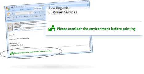
“Please think of the environment before printing this email.”
You’ve almost certainly seen that line in an email before. There’s even a website — ThinkBeforePrinting.org — dedicated to pushing this forward. (They’re using that site as an entry way to up-sell you on ink, interestingly.) Here’s what they suggest you add to your emails:
Adding that to your email is almost certainly not good for the environment. There’s little reason to think that it actually prevents people from printing the emails, and when they do, they’re now using color ink (which costs as much as 25% more than black). They’re also adding lines to print jobs, increasing the amount of paper used as well. (Maybe it’s the thought that counts?)
But there may be one much simpler way to help the environment a bit via your emailing habits. Just change your typeface.
In 2010, citing $100,000 in annual toner expenses — that’s six figures of printer ink — the University of Wisconsin-Green Bay (UWGB) explored cost-cutting efforts. As NPR explained, administrators at the school learned about something called an “eco-font.” Most fonts use a lot of ink because each character is printed as a solid letter, but eco-fonts were designed to use small, hollow circles instead. These circles are packed densely enough so that readers can seamlessly determine which letters are printed on the paper, but the empty space saves reduces ink consumption by as much as 50%.
Eco-fonts, though, aren’t a generic idea — they’re a commercial product, one offered by a single company of the same name, minus the hyphen. A three-computer license costs about $55, and UWGB has (and had) a lot more than three computers; the university’s website claims 500 in the computer labs alone. Even at a great discount, the cost of buying licenses would likely surpass the savings from the forgone ink purchases. But then UWGB officials learned that a more common typeface — one standard on Windows machines — had a similar effect. Century Gothic, due to its thin lines, used roughly 30% less ink than Arial, which the university was previously using as the default typeface for emails. So the school set Century Gothic as its default email typeface.
Of course, not all of UWGB’s toner costs were from people needlessly printing emails, making this decision likely a PR stunt aimed at underscoring the university’s asserted commitment to finding environmentally friendly alternatives. Besides, there’s another reason to think that the move didn’t save UWGB much, if any money — while Century Gothic uses less ink than Arial, it is a significantly wider font and therefore, uses more paper.
Bonus Fact: While it may seem obsessive to try and cut a small faction of one’s printer ink/toner costs, there’s a good reason for that — toner is incredibly expensive. Priced based on volume, it’s more expensive than both blood and champagne.
From the Archives: Paper Trail: How your printer may be tracking you.
Related: An encyclopedia of typefaces.