Why The Dot Got Dashed
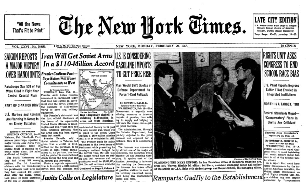
Pictured above is the front page of the New York Times from February 20, 1967. The headlines aren’t anything beyond the normal news of the day — there’s a story about the Vietnam War, another about the Cold War, one about gas prices, and one about civil rights. Just a regular day in the mid-to-late 1960s.
In fact, let’s look at the next day’s front page — February 21 — and you’ll see more of the same. Some local news on the left, and a crime-related headline in the center, but there’s more about Vietnam and the Cold War.
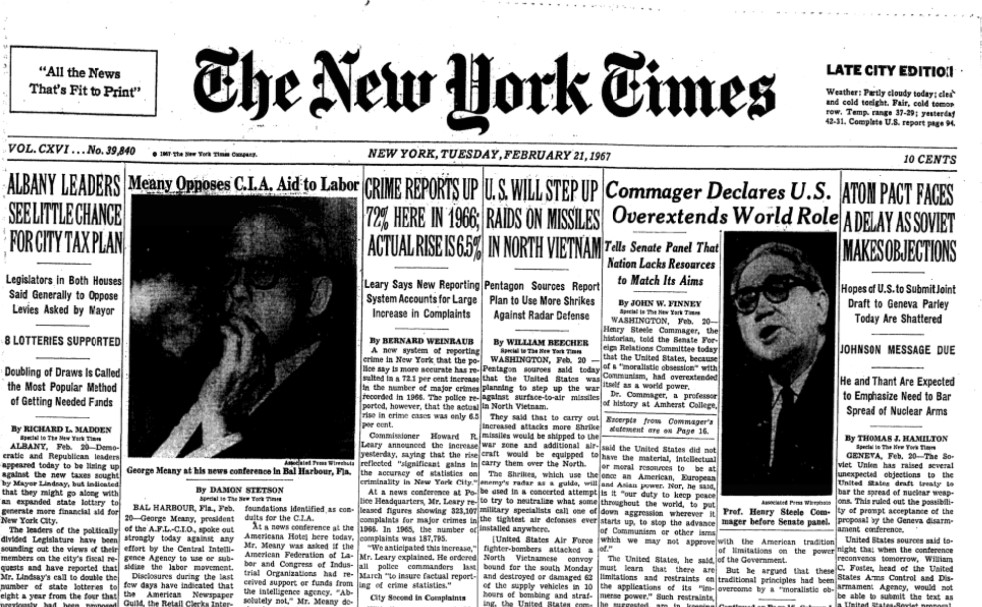
But there are some differences. Take a look at the top of each paper, above the news itself. Both have a box on the left that says “All the News That’s Fit to Print!,” the Times’ long-time motto, and a spot on the other end flagging that this was the late edition of the paper. Both underwent slight design changes, but they’re not alone. Check out the nameplate — the words “The New York Times” itself. In the top picture, it’s punctuated with a period. But starting on February 21st, that dot was gone.
It was a controversial change. But in the end, the designer won — because it also saved the paper a few dozen bucks.
The Times was founded in 1851 and its official logo has rarely been revised since, with most revisions (including dropping a hyphen between “New” and “York” in 1896) occurred in the 19th century. But in 1953, the paper hired Louis Silverstein as its design director, and Silverstein wanted to give the paper a somewhat more modern look. He made a few changes that few of us would notice, including increasing the font size from 8 to 8.5, but most of those changes were uncontroversial. That wasn’t the case with the nameplate.
In late 1966 or early 1967, Silverstein hired typeface designer Ed Benguiat to rework the Times’ nameplate. Again, most of the changes were subtle; if you take a close look at the vertical stripe adorning the “T”s in “The” and “Times,” you’ll see that the pre-February 21 ones have an arrow in the middle of them but the current one has a diamond. But Benguiat also removed the period at the end of the non-sentence in the nameplate. Readers were less than thrilled, as the Times recounted in 2017:
“How would you like to wake up and find your wife’s face had changed?” one of the angry letter writers asked The Times. “No tittle in your title?” asked another. Someone else wondered, “Why scrub a period in history?”
The redesign was like “performing plastic surgery on Helen of Troy,” another reader complained.” Still another lamented the punctuated nameplate as a grand old landmark that had “vanished into oblivion.”
Leadership wasn’t surprised by the reaction, though. When Silverstein brought the idea to them, they balked. Design writer Steven Heller, a friend of Silverstein, later shared a passage from the latter’s unpublished memoir about the kerfuffle, noting that “dropping the period caused much consternation and soul-searching at the Times,” and it almost didn’t happen.
So what convinced management to go without the dot? Saving a few bucks, apparently. As the Times itself reported, “John Radosta, who was then the picture editor, worked with a professor at New York University to determine — their tongues in cheek — that not printing the period would spare The Times $41.28 in costs each year.” And per Silverstein’s memoir, “that saved the day.”
Bonus fact: In 2002, 7up released a version of their soda called “dnL,” which if you look carefully, is just the letters “7up” but upside down. The goal was to create a product that was, as the flipped logo suggested, the opposite of their main product. The normal 7up is a clear soda in a green bottle; dnL was a green soda in a clear bottle. 7up was caffeine-free; dnL had a lot of caffeine. And, ridiculously, 7up is marketed as “lemon-lime” flavored, while dnL was said to be “lime-lemon.” The product was discontinued in 2006. (But, from experience, not before annoying people whose initials are “DNL.”)
From the Archives: Hidden Messages: The hidden elements in some well-known logos. (You’ll never be able to look at the FedEx logo the same way again.)