The Curious Case of the Upper Case Lower Case N
Hi!
As long-time readers know, on Fridays — like, you know, today — I do a week-in-review type of thing. Today I’m going to share something I learned, but there’s no story behind it, so I don’t have a full “story” to write. So, prepare to walk away from today’s newsletter without a sense of fulfillment.
On the other hand, you’ll probably point this out to everyone you see, every time you see it. Because you’ll never be able to not notice again. (Or, at least, I can’t.)
Ready?
Let’s look at some corporate logos.


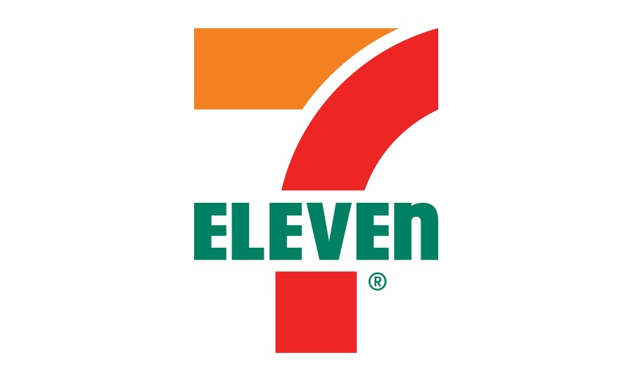
In order, you have the 7-Eleven logo, the ESPN logo, and an old logo for Wendy’s. Notice anything strange, but in all three?
I didn’t. Not until someone pointed it out.
All three of the logos use upper-case lettering for their brand names. But in all three situations, the letter “N” is actually a lower-case N, just made bigger to match the size of the other letters.
I can’t find a good explanation for this, in part because one may not exist. A few years ago, 7-Eleven’s communications group told Reader’s Digest that “one theory is that [founder Joe C.] Thompson’s wife thought the logo seemed a little harsh with all capital letters and suggested that the capital ‘N’ be changed to lowercase so the logo would look more graceful.” But that’s speculation at best, as 7-Eleven itself admits.
There’s even less out there about the ESPN and Wendy’s logos. ESPN used to stand for “Entertainment and Sports Programming Network,” and at first, I guessed that they just wanted that white thru-line running across the whole logo, but a look at their original logo (here) proves that theory wrong. And Wendy’s, in fairness, also has a lower-case Y, so it’s less out of place. (Their new logo, here, using all lower-case letters after the W.)
So: I give up. But I’ll never be able to unsee this.
Oh, and before you email me about the FedEx arrow, the Toblerone bear, Goodwill’s smiling G, the Tostito’s partiers, Amazon’s smile, or the rumored-but-untrue Klan messaging on packs of Marlboro’s, click here.
The Now I Know Week in Review
Monday: The Great Cookie– er, Biscuit– er, Cake Debate of 1991: For what it’s worth, I think they’re… just kidding, I’m not getting into this debate.
Tuesday: Why Congress Gets Free Men’s Magazines: Strange First Amendment tricks.
Wednesday: The Hidden Danger in the Walls of Your Old House: I haven’t read most/all/any of my email yet from this week, but at a glance, it looks like I don’t know what type of razors these are. I’ll update the story eventually, but in any event, these are indeed razors of some type.
Thursday: The Controversy Around Neil Armstrong’s Famous Quote: It’s all about the letter “a.”
And some other things you should check out:
Some long reads for the weekend.
1) “Stealing White” (Bloomberg Businessweek, 15 minutes, February 2016). The subhead: “How a corporate spy swiped plans for DuPont’s billion-dollar color formula.”
2) “Letters From an Arsonist” (Washington City Paper, 44 minutes, May 2007). This one isn’t as much fun, as the subhead suggests: “Thomas Sweatt torched Washington for decades. He killed more people than we thought.” However, I have to point out that a mass arsonist whose last name is “Sweatt” is rather amazing (save for the additional “t”).
3) “Big banks entrusted money to GardaWorld. It secretly lost track of millions.” (Tampa Bay Times, 28 minutes, October 2020). This is actually the second part of a three-part series, but I didn’t realize it right away. You don’t have to read all the parts to appreciate this entry, but I’m sure it helps.
Have a great weekend!
Dan
