The Off-Color Golden Arches

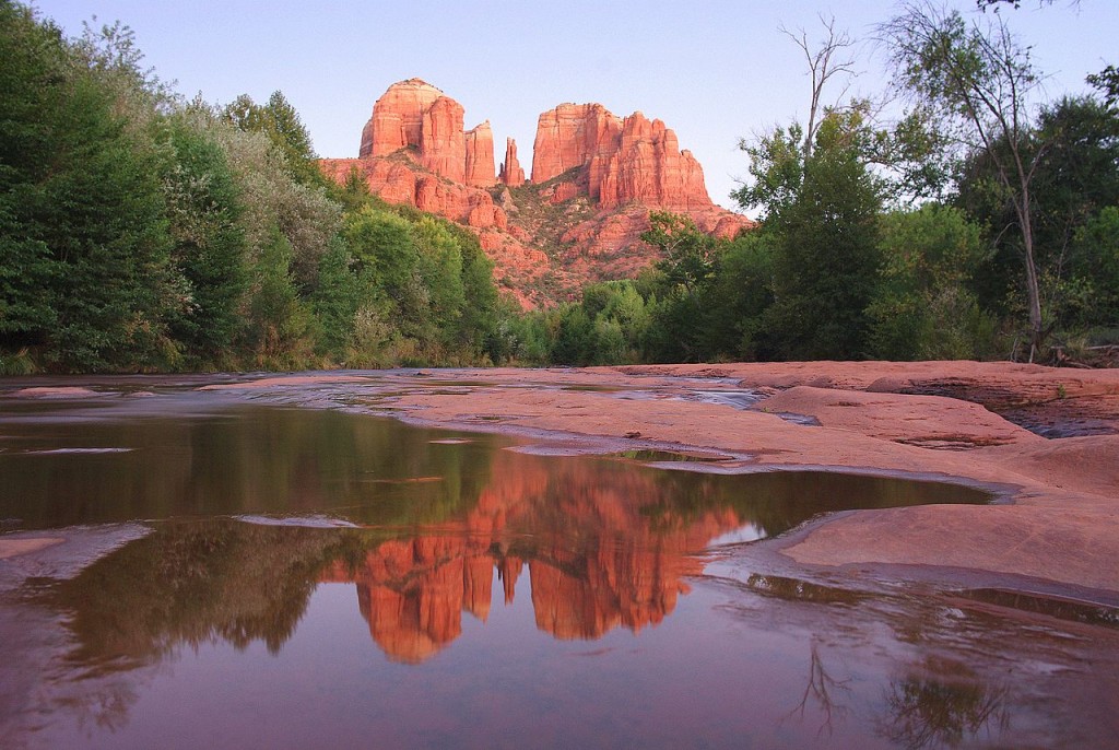
If you take a drive up West State Route 89A in the Arizona city of Sedona, you’ll come across a lot of familiar signs along the way. There’s a Walgreens, a Starbucks, a Safeway, a Wells Fargo, and a McDonalds all within a few minutes of one another — the brands may change, but those are the types of chains you’ll see in almost any American city. But what makes this particular stretch of American highway different is the backdrop. Sedona is well-known for its outcroppings of red sandstone, an example of which can be seen above. These rocks seem to glow in the sunset — here’s a gallery via Google Images — making Sedona something of a tourist attraction. Below is what you may see if you’re standing in the middle of the road on Route 89A there, and if you look around, you’ll see a lot of more of that red sandstone peeking out.
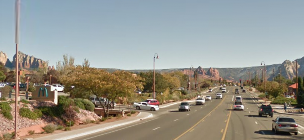
But there’s something else unique in that picture. If you look at the image above very closely — focusing on the far left, about a third of the way up from the bottom — you’ll see something you won’t see anywhere else: a blue McDonald’s logo.
McDonald’s logo is the parabolic M seen here and, almost always, in the golden yellow color of a poorly-made french fry. It’s known as the “Golden Arches,” a moniker which has been used so often, it has become a nickname for McDonald’s itself. The color isn’t something that is typically left to individual franchisees to adjust at their pleasure; rather, as any brand marketer will tell you, even a slight deviation from the approved yellow-on-red shade would likely result in rebuke. And yet, there it is, a teal M against a beige backdrop. Here’s a closer view.
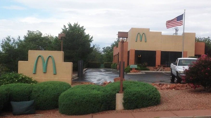
The deviation from normal is because of strict local signage ordinances aimed to prevent the scenic backdrop from taking a back seat to the retail landscape. (Let’s be honest: the yellow and red color scheme of the regular McDonald’s logo would be a garish addition to the skyline.) The Santa Barbara Independent put it bluntly: “Leaders wanted no vulgar, ticky-tacky, pseudo-gold conflicting with the warm glow from Mother Nature’s buttes, mesas, and towering cathedral-like mountains.”
McDonald’s seemed to agree (but not as vociferously), or, at least, tolerate the local ordinance without much objection. Instead, the fast food giant and the local officials got together to create a new solution. Per one report, the commercial area “had mostly teal and red signage during the mid-1990s, so the community development director at the time suggested the restaurant adopt a similar look.” McDonald’s agreed.
The sign has become a tourism draw within a tourism draw — there are a surprisingly high number of social media posts featuring people posing next to the teal M. (Here’s an example.) McDonald’s themselves even advertised the novelty of the off-brand Arches. It’s a pretty special sight to see if you’re into off-brand logos. And yet, sometimes the teal arches fans overstate the logo’s significance. The establishment is often referred to as the only non-yellow-logoed Mickey D’s, but that’s not quite true — there’s a black-arched one in California and one with white arches in France. Like the Sedona one, local laws are the cause for the atypical signs.
Bonus fact: The Golden Arches date back to 1962, but McDonald’s itself is two decades older. Before the M-stylized arches was a single-arch logo, but that’s long gone — with one exception. The McDonald’s in Pine Bluff, Arkansas, still uses the single-arch logo, as seen here. The burger joint moved a few blocks in 2007, but the arch moved with it. Per Wikipedia, the sign was added to the National Register of Historic Places in 2006 (which has since been updated to reflect the sign’s current position).
From the Archives: The Hidden Secret Behind This Upscale Australian Cafe: The McDonald’s in disguise.
Related: “How and Why to Franchise Your Business” by Michael A. Peterson. Four reviews, 4.7 stars on average.